Remember the hilariously misleading graph the New York Timespublished regarding the George Floyd Black Lives Matter racial reckoning and the homicide rate, which, in the real world, surged historically in the days following Floyd’s demise on May 25, 2020?
The usually competent graph designers at the NYT placed the dashed vertical line indicating Floyd’s death after the 29% increase in homicides in 2020, when the large majority of the explosion in murders followed the cultural revolution of May 25, 2020 as the cops retreated to the donut shop.
This Substack is reader-supported. To receive new posts and support my work, consider becoming a free or paid subscriber.
So, I sent the following email to the New York Times calling for a correction on May 26, 2025.
Dear New York Times:
You are being widely criticized on social media for a graph appearing in your May 24, 2025 article:
The number of people killed by the police has risen every year since the murder of Mr. Floyd by a Minneapolis officer in 2020.
By Steven Rich, Tim Arango, and Nicholas Bogel-Burroughs, Graphics by Daniel Wood
May 24, 2025
Here's the much scoffed-at graph:
Please take a moment to look at the graph and see what is so extraordinarily misleading about it regarding one of the most important social science questions of the 2020s: did the elite embrace of Black Lives Matter after George Floyd's death on May 25, 2020 get a massive number more African-American lives killed by increased homicides (and by increased motor vehicle accidents)?
Your graph makes it look like the huge surge in homicides (about 29% across all races) mostly happened _before_ Floyd's demise when, in reality, according to CDC WONDER mortality data, most of the increase happened in the weeks immediately after his death during the time of the media-celebrated "mostly peaceful protests" as the police retreated to the donut shop.
Your graphic artist made the obvious mistake of creating a line graph that attributes all homicides of 2020 to January 1, 2020, so the vertical dashed line for Floyd's death follows rather than precedes the big surge.
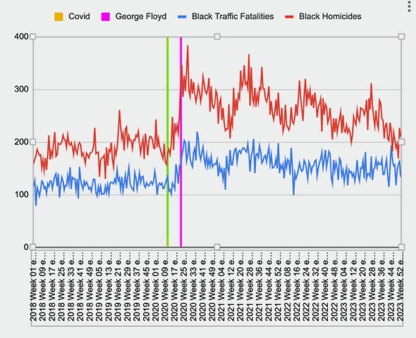
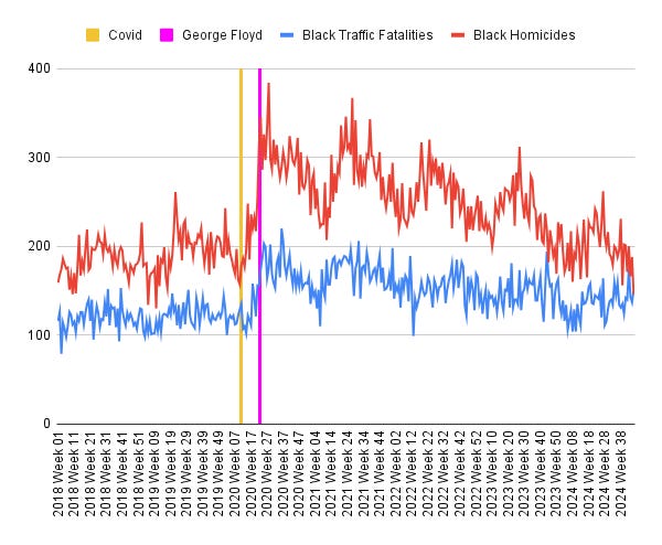
In contrast, here's my graph of weekly CDC mortality data of black homicide and motor vehicle deaths from the beginning of 2018 to mid-November 2024 (the CDC imposes a 6 month lag on reporting murders and car crashes to let coroners have time to do their work).
Update: Here’s my cosmetically improved version of my graph:
As you can see, the beginning of the post-Floyd Racial Reckoning during the last days of May 2020 saw a historic surge in black lives being splattered by gunfire and car crashes, probably due to less pro-active policing. The black-on-black homicide surge is finally abating, but the increase in black car crash death rate remained elevated at least through late 2024.
This would seem to be one of the most important findings of American social science of this era, but the NYT has been extremely weak at reporting on it over the last five years.
Here's is my Taki's Magazine column from May 21, 2025 that goes into the actual trends in detail:


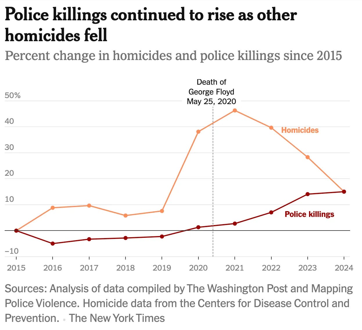

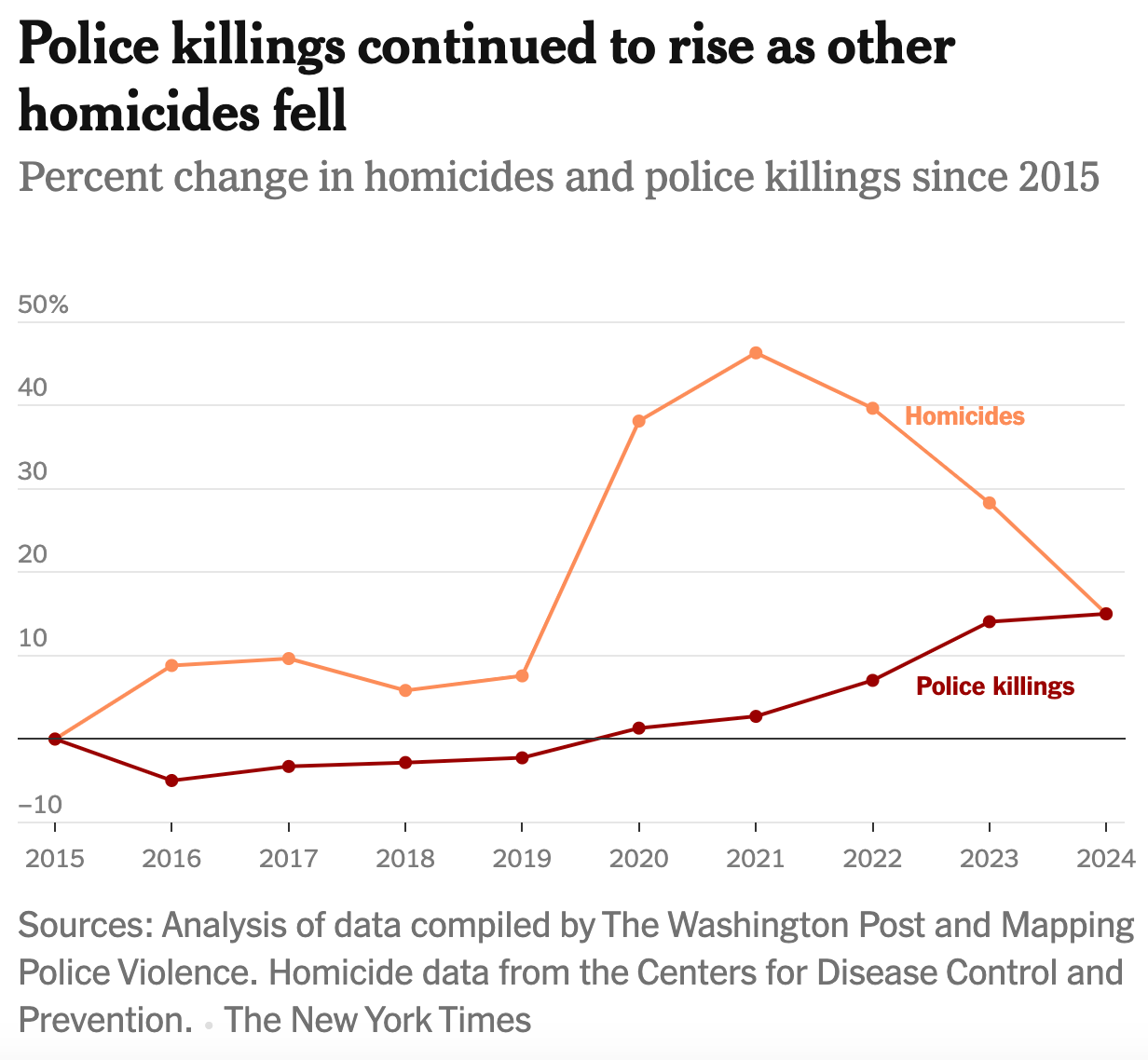
So the NYT produces a line graph for this data, where 2019,2020,2021,2022 etc are represented by points.
Time is continuous data, not discrete data.
A bar chart would be better.
Unless a) you wanted to fool people or b) you have no idea about statistics.
So here's the deal.
They are showing this graph on an annual basis, and showing percentage changes.
But they're not showing the actual number of deaths.
You know, and I know, that there are HUGE disparities in these numbers, before we even get into aspects of "justified" homicide, yadda yadda.
I am not amused with their bullshit.