
Three New Nature - Nurture Studies
Are Northern Italians more patient than Sicilians? Is mythology spread across genetic lineages? Is IQ due to nature or nurture?

There are three interesting new studies out, which I haven’t actually read all the way through. So I’ll put this out without the paywall for your comments (your comments are especially welcome if you’ve actually read all of one or more of these papers):
Patience and Subnational Differences in Human Capital: Regional Analysis with Facebook Interests
Eric A. Hanushek, Lavinia Kinne, Pietro Sancassani, and Ludger Woessmann
Abstract
Decisions to invest in human capital depend on people’s time preferences. This paper shows that differences in patience are closely related to substantial subnational differences in educational achievement, leading to new perspectives on longstanding within-country disparities. We use social-media data – Facebook interests – to construct novel regional measures of patience within Italy and the United States. The approach is first validated with a cross-country analysis of patience and Facebook interests. We then show that patience is strongly positively associated with student achievement across regions in both countries, accounting for three-quarters of the achievement variation across Italian regions and one-third across U.S. states. The finding is confirmed in an identification strategy employing variation in ancestry countries of the current population of U.S. states. Results hold for six other countries with more limited regional achievement data.
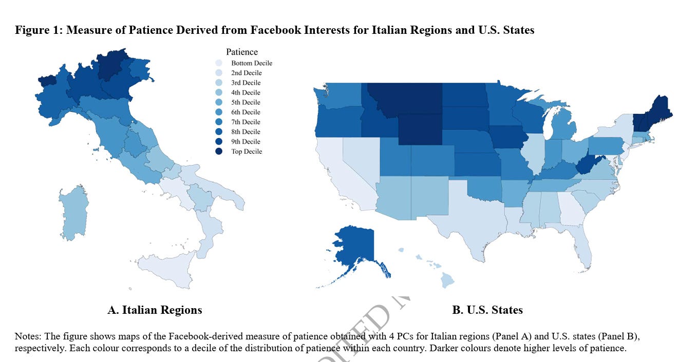
I can well believe that South Tyrol and Aosta Valley in the Alps are the most patient provinces of Italy, while Sicily and Campania are the least. But is rootin’-tootin’ West Virginia really one of the top six most patient states in the U.S.?
Maybe West Virginians are patient in the sense that they haven’t gotten the hell out of West Virginia yet?
The U.S. map mostly looks like the usual Diversity Map of the U.S.
Worldwide patterns in mythology echo the human expansion out of Africa
Hélios Delbrassine, Massimo Mezzavilla, Leonardo Vallini, Yuri Berezkin, Eugenio Bortolini, Jamshid Tehrani, Luca Pagani
doi: https://doi.org/10.1101/2025.01.24.634692
This article is a preprint and has not been certified by peer review
Abstract
Similarities between geographically distant mythological and folkloric traditions have been noted for a long time. With the elaboration of large banks of data describing the presence and absence of narrative motifs around the world, scholars have been able to statistically investigate their potential routes and mechanisms of diffusion. However, despite genetic data allowing for increasingly refined demographic movement inferences, few have integrated it into their models, and none at a global scale. In this work, we capitalise on the augmenting availability of modern and ancient genetic data and on Yuri E. Berezkin’s database of more than 2000 mythological motifs worldwide to investigate the mechanisms involved in generating their present-day distribution at a global scale. The direct combination of both kinds of evidence allows us to explore in more depth the respective influences of population movement and replacement versus cultural diffusion on motif transmission. Our results show that both processes have played important roles in shaping their present-day distribution. By leveraging available ancient DNA (aDNA) and deepening the temporal scale of the detected signals, we reveal that correlations between mythemes and genetic patterns can be traced back to population movements that pre-date the Last Glacial Maximum and go back to at least 38,000 years ago, and possibly even earlier to the human expansion out of Africa some 60,000 years ago. Our work shows the earliest evidence for the transmission of stories and storytelling in human history, and supports the joint use of cultural evolutionary theory and population genetics to illuminate the biocultural processes that shaped our species….
In this work, we capitalise on the increased availability of modern and ancient genetic data and on Yuri E. Berezkin’s large database of worldwide mythological and folkloric motifs 5, which reports the presence and absence of more than 2000 “mythemes” (defined as concepts, images, or other stable narrative features) in almost 1000 traditions (as of 2018), to study their mechanisms and potential times of diffusion. To do so, we compute mythological distances and correlate them with genetic ones on the one hand (to test for a demic signal) and with geographical ones on the other (to test for cultural dissemination), adapting the methodology developed by Bortolini et al. (2017)39. By applying it to various geographical, mythological, and temporal ensembles, we aim to assess the time depth of the processes explaining present-day mytheme distribution worldwide.
So, mythologies seem to get passed on from parents to their genetic children.
Is this due to nature (some lineages are genetically inclined toward liking mythological element X, while others like mythological element Y)? Or is it due to nurture (tribe A tells myth X to their kids, while tribe B tells myth Y to their kids)?
Nurture seems more plausible on the whole for the spread of culture.
But you can see why nature and nurture are often hard to tell apart.
June 23, 2025 CDT
Lin, Y., Procopio, F., Keser, E., Kawakami, K., Rimfeld, K., Malanchini, M., & Plomin, R. (2025).
Abstract
The prediction of behavioral traits from polygenic score (PGS) in the population is strongest for cognitive and educational traits, which include intelligence, cognitive abilities, and educational attainment and achievement. For educational attainment, this greater predictive power of PGS appears to be due to substantial shared family-level (between-family) genetic effects, such as ancestral, mating, and family processes, that are not reflected within families at the level of the individual.
Here, we extend our previous work by systematically investigating PGS prediction within and between sibling pairs for intelligence, cognitive abilities, and educational traits in childhood, adolescence, and early adulthood. We assess within-family PGS prediction from dizygotic twin differences and population-level prediction from unrelated individuals; the extent to which the within-family prediction is less than the population-level prediction indexes between-family effects. We used 6972 unrelated individuals and 3306 dizygotic [fraternal] twin pairs from the UK Twins Early Development Study [Plomin’s study]. We compared the results for cognitive traits to height and body mass index (BMI). Finally, we assessed the extent to which socioeconomic status accounts for between-family effects.
Results showed that within- and between-family effects contributed about equally to PGS prediction across cognitive and educational traits. Similar results emerged across development, despite population PGS prediction doubling. In contrast, for height and BMI, the within-family component accounted for most of the population prediction. We also confirmed that socioeconomic status largely accounted for the between-family effects.
We discuss the implications of these findings for interpreting PGS prediction of cognitive and educational traits in the population and within and between families. Although between-family effects have been considered as a source of bias, we argue that between-family as well as within-family effects are legitimate sources of genetic variance for predicting individual differences in the population.
Introduction
The greatest advance in a century of behavioral genetic research has been the ability to predict individual differences in behavior directly from DNA in addition to estimating genetic effects indirectly using twin and adoption designs. After a disappointing decade of candidate-gene results that failed to replicate (Border et al., 2019; Chabris et al., 2012), by 2005, DNA microarrays made it possible to investigate hundreds of thousands of DNA variants (single-nucleotide polymorphisms, SNPs) in genome-wide association (GWA) analyses. In 2007, genome-wide association was shown to yield replicable associations with common disorders (The Wellcome Trust Case Control Consortium, 2007). However, the largest effect sizes of SNPs were extremely small, which led to the construction of polygenic scores (PGS) that aggregate SNP associations in a composite that can be used to predict individual differences in behavior (Purcell et al., 2009). Currently, the strongest PGS predictions in the behavioral domain can be made for cognitive and educational traits, which include intelligence, cognitive abilities, educational achievement, and years of schooling (educational attainment). PGS can predict, in independent samples of unrelated individuals, up to 11% of the variance for cognitive abilities (Procopio et al., 2024), 18% for educational achievement (Allegrini et al., 2020), and 14% for educational attainment (Okbay et al., 2022).
It is not coincidental that cognitive and educational traits not only show the strongest PGS prediction, but they also show the greatest evidence of family-level (between-family, BF) effects such as population stratification, assortative mating, and passive genotype-environment correlation that are not reflected within families (WF), as illustrated in Figure 1. One of the most important goals of PGS is to predict individual differences in the population; for example, predicting which children are likely to have problems learning to read. For this reason, estimates of the variance explained by a PGS are based on unrelated individuals, that is, one individual per family. In contrast, the WF contribution to this population prediction can be assessed by regressing sibling PGS differences with sibling trait differences. WF differences arise largely from variations in the meiotic inheritance of alleles, a process that is essentially random. This approach excludes BF effects, as siblings share the same parents and, consequently, the same family-level genetic influences from assortative mating, population stratification, and passive genotype-environment correlation (Benyamin et al., 2009). These BF effects can therefore be indexed as the extent to which the population correlation exceeds the WF correlation.
Back in the 20th Century, it was expected that Real Soon Now geneticists would discover the main reason that people have suboptimal outcomes in life was a Single Bad Gene, as with sickle cell anemia or Huntington’s disease. Thus at the 2000 White House ceremony to celebrate the Human Genome Project, Bill Clinton and Tony Blair speculated about people in their audience living to be a couple of hundred years old due to the decoding of the human genome.
So far, that hasn’t happened, in part because, in general, your genes didn’t evolve to kill you.
So it turned out around 2010 that most interesting things about humans, like height or intelligence, were less due to Single Bad Genes than due to hundreds or thousands of genes of small effect.
This made sample size hugely important, and that’s not necessarily easy to obtain.
Educational attainment is the behavioral trait with the most colossal PGS sample size: James Lee assembled 1 million people for whom we have their DNA who also checked a box on a form attesting to how far they had gotten in school: did you drop out of 8th grade to work in the mines to pay for your mother’s medicine, or did your grandparents subsidize your lavish Soho loft as you languorously earned your NYU doctorate in folklore? The Okbay et al (2022) extended it to 3 million.
As my examples suggest, educational attainment tends to confound nature and nurture. People with Ph.D.’s in folklore tend to have more nature for intelligence than people who dropped out of grade school to shovel coal. On the other hand, they also tend to have more nurture in terms of their relatives writing checks.
But this new study finds that height is, these days, largely predicted by Within Family PGS rather than Between Family PGS. This probably wasn’t true in England in Victorian times. For example, according to Barbara Tuchman, Lord Salisbury’s Tory cabinet of 1895 averaged 6’0” tall, about a half foot taller than the average Brit of the period.

But not only educational attainment but also that IQ and g are more comparably distributed Within and Between families, suggesting (as I’ve been implying since the last Millennium) that both nature and nurture matter.
"The U.S. map mostly looks like the usual Diversity Map of the U.S."
As some wag on Marginal Revolution pointed out when an economist tries to prove for the umpteenth time that the drug trade causes violence, "hey look it's that map again."
It's always the same map, over and over.
I bet social scientists will get a lot less granular as AI ramps up and starts plowing through gazillion billion numbers. Obviously these researchers don't want to dial down to the municipal level with their thermal maps. ("Why is Illinois so impatient? Fascinating.") Only poor old West Virginia saves the methodology for politically correct social scientists.
States are actually terrible data sets; urban and rural are different planets. So are the Native reservations.
PGS scores are a poor instrument for measuring the intelligence of any one individual, but they are very good for measuring the average intelligence of a population (or rather its average capacity for intelligence). The correlation is 90% between mean population IQ and mean PGS for educational attainment. That's a high figure, given that educational attainment is an imperfect measure of intelligence.
To estimate mean IQ , you don't have to measure the PGS score of every single member of a population. Or even a majority. All you need is a representative sample, which can be as little as 30 individuals.
It's like estimating the proportions of red and green jellybeans in a jar. An estimate is impossible if you take out a single jellybean. But if you scoop out a large enough number, a decent estimate becomes possible.